

Project One
Project Excel: Heuristic Evaluation + User Testing

Overview
IBM Cloud Pak® for Business Automation is a set of integrated market-leading software designed to help you solve your toughest operational challenges. This software consist of actionable AI-generated recommendations, built-in analytics to measure impact, and business-friendly low-code tooling.

How did this project start?
At the request of Rob Thomas, Senior Vice President of IBM Cloud and Data Platform, "Project Excel" was initiated to identify barriers and implement solutions to enhance the trial user experience for IBM's Cloud Paks throughout the user journey stages, including discover, learn, register, get started, first use, and purchase. Specifically for the IBM Cloud Pak for Business Automation page, our task was to create an as-is user journey map for the discover, learn, try, and demo stages.
Team Members

Stakeholders
The automation, marketing, analytics, SaaS, design, and research teams collaborated to establish research objectives, and I took full responsibility for leading the research study. The team comprised of design, research, analytics, and offering managers.
Methodology

Research Methodology:
Heuristic Evaluation + User Testing
Participants: 6 users
Roles: Customer Operations Manager, Senior Manager, Marketing Operations Manager, Business Analyst, and so on.
What are we evaluating and testing?
Based on the existing user journey map, participants will be evaluating the marketing page of the Cloud Pak for Business Automation and testing the SaaS trial experience. They will follow the "Discover, learn, try, and demo" flow of the current user journey, starting with a user scenario.
"Imagine you want to find a business automation platform to evaluate which solutions address your organization's workflow orchestration, decision managing, and task automation so that you can create and manage AI-directed workflows to automate business processes, use AI to gain understanding and better governance over your enterprise content, and so on."
Findings

Process
After performing a heuristic evaluation of IBM Cloud Pak for Business Automation's Discover, Learn, Try, and Buy journey, we utilized Nielsen's 10 usability heuristics to assess the experience. Our evaluation revealed a total of 42 issues, consisting of 13 critical, 16 moderate, and 13 minor.
Issues per stage of the user journey
Critical: Trial/Trial getting started (8), Learn (1), Signup (2), and Discover/Marketing (2)
Moderate: Trial/Trial getting started (8), Learn (4), Signup (1), Discover/Marketing (3)
Minor: Trial/Trial getting started (4), Learn (3), Signup (3), Discover/Marketing (3)
10 Usability Heuristics
10 Heuristics Used to Evaluate the Product
Visibility of systems
The system keeps users informed of what is going on.
Recognition rather than recall
Minimize the user’s memory load by ensuring that they don’t have to recall information from other portions of the interface.
Help & documentation
Help and documentation should be readily available for the user. It should be approachable and not redirect the user’s attention.
Error prevention
The actions in the system should be clear for the users before they perform them.
Recognize, diagnose & recover from errors
Errors within the interface should present clear solutions for recovery, enabling users to easily return to their previous screen.
Consistency & standards
Use consistent language and interaction conventions across the platform.
Aesthetic & minimalist design
The system’s content and focus should be on the essential actions and information.
User control & freedom
Allow users to recover from mistakes easily by supporting an undo and redo capability.
Match between system & real world
The system speaks the user’s language and follows real world conventions.
Flexibility & efficiency of use
Make things simple enough so novice users know how to use the system while promoting efficiency for advanced users.
Severity Scale

Critical
A significant usability issue that is difficult to recover from and/or are difficult to avoid. These issues must be fixed immediately!

Moderate
Frequently occurring issues that impacts usability, requiring user’s effort to be resolved. These should be remedied as quickly as possible.

Minor
Slight issue that causes a usability problem and can easily be fixed. However, is still impacting the user’s experience in some way. Minor issues should still be addressed as soon as possible
Overall Themes
1: A need for guidance
Users needed constant guidance when accessing the trial though walk me tour was provided. When arriving onto the demo trial, users should be given a thorough step-by-step tour guide to walk them through.
2: Navigation issues
Constant navigation issues occurred through the trial experience. Users clicked on links that navigated them out of the trial and product. Throughout the page and the trial experience, multiple links brought the users out of context.
3: Misunderstanding of the product
As users glanced through the marketing page, they misunderstood the context of the product. With a lot of content, users were mislead on what “Paks” are and what is included with the IBM Cloud Pak for Business Automation.
4: Misinformed information in the signup
The signup process of the Trial had concerning questions, related to issues with filling out and signing up for an account. However, questions emerged from the Trial Signup of the Automation Trial.
5: Misinterpretation of content
Minor issues were linked around terminologies and functions within the page. Users didn’t understand the context, such as having multiple sections and links that are unrelated to the product. Users expected constructive information.
6: Overwhelming content
Users were flustered with the amount of data and text throughout the page. Text-heavy content can be overwhelming as users tend to be fatigued and misunderstand the content or forget what they are reading.
A need for guidance

Too many hand-holding
Walk Me Tour Wasn’t Effective: Upon logging in, users are presented with a walk-through tour. However, they may still be unsure about what actions to take next without explicit instructions.
"I would want a simplified version of the whole experience. I would want step by step guide to walk me through creating an automated workflow. So use cases where you are so and so analyst and looking to automate something. So simple workflow teaching you to create. And also, a feel good perspective to walk away from tutorial after 5 minutes creating your first automated workflow. I think that would encourage people to see how simple it is to use and how much benefit it is" - Business Analyst
Walk Me Tour Should Provide More Details: The majority of users expressed dissatisfaction with the walk-through tour, stating that they were expecting a more interactive and engaging trial experience.
"It would be nice to see what kind of templates are available. I can do without the tour guide. I know what a navigation bar is and help me button does.” - Customer Operations Manager
A need for guidance continues...
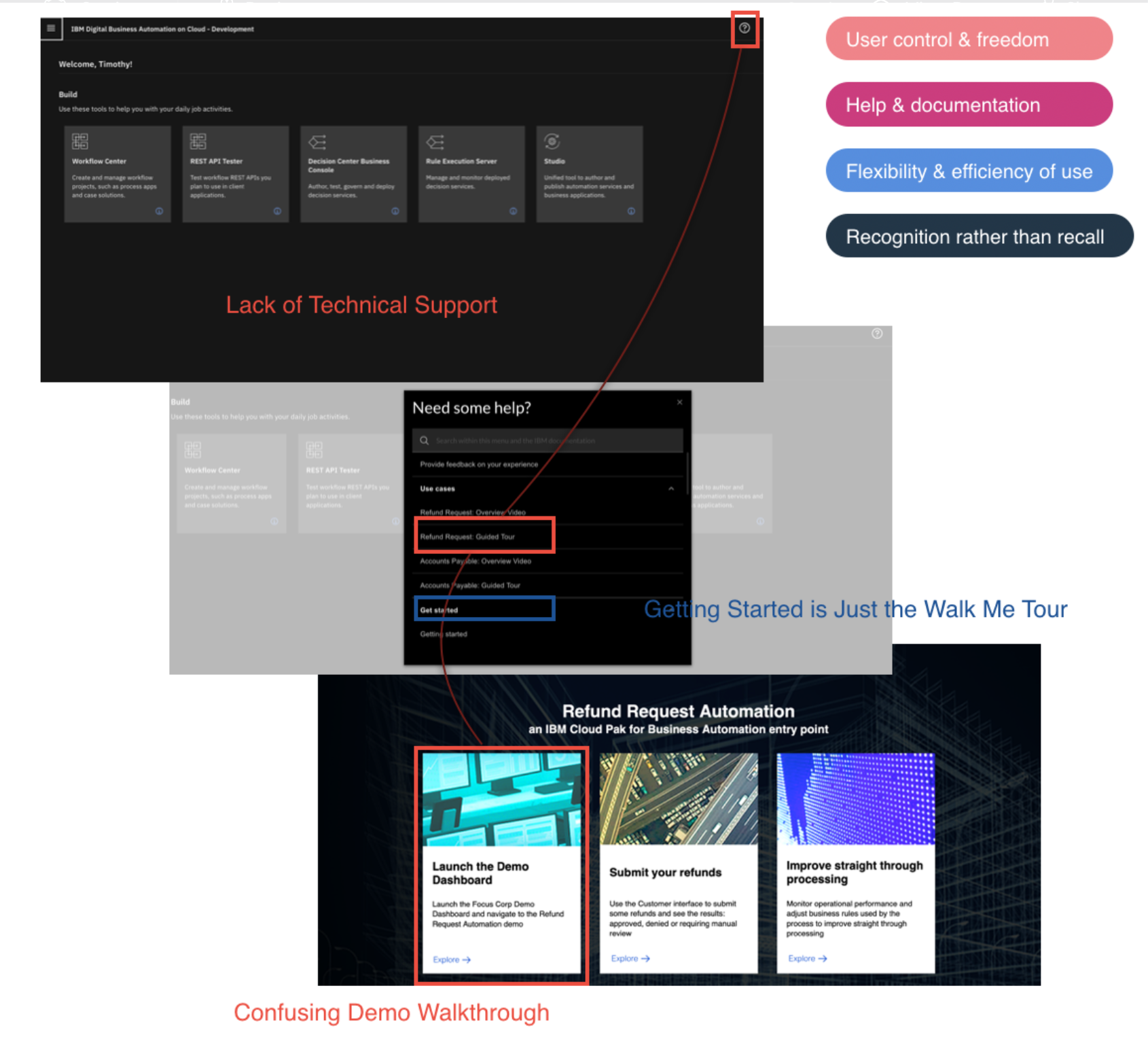
Technical Support is Lacking: Users do not have access to a technical support team or chat on the homepage to seek guidance when they get lost within the demo trial.
Confusing Demo Walk-through: The demo walk-through is confusing for users, as it presents a complicated layout that appears to be three separate tasks and then directs them to a more complex slide presentation. Users mistakenly believe that each box represents a distinct demo and end up completing only one task, such as "Launch the Demo Dashboard." Only one user followed each slide thoroughly.
Getting Started is Just the Walk Me Tour: Clicking on "Getting Started" only leads users to the same walk-through that appears when they sign in, which adds to their confusion.

Recommendations
To improve the trial user experience, we recommend providing a more comprehensive walk-through, which condenses the step-by-step processes of each use case into a single document. We also suggest adding a checklist feature to enable users to track their progress as they complete each task. Furthermore, a chat box or some other form of on-demand assistance could be included to provide guidance and support when users get stuck at any stage of their experience.
Potential Impact: By implementing these recommendations, users will be able to navigate the trial without requiring external support. They will be able to apply their chosen use cases to the product efficiently and effectively, resulting in a productive and beneficial experience.
Navigation Issues

Too many hand-holding
Uncertainty Towards the Trial Navigation: During the trial, users encounter uncertainty when navigating through the use cases and trying to return to the trial homepage to complete tasks from the demo.
Misleading Trial Navigation: Furthermore, the trial navigation can be misleading as users may assume that clicking the X or home button from the use case demo will take them back to the trial homepage, but instead, it redirects them to a different site, causing confusion and frustration.

Recommendations
To improve the trial experience, we recommend creating a more comprehensive walk-through that includes all use cases in a single document. Additionally, a checklist feature could help users track their progress as they complete each task. Consider adding a chat box to provide users with support when they get stuck.
Potential Impact: By implementing these changes, users will be able to navigate the trial more easily and effectively. This will lead to a more productive and beneficial experience, and reduce the need for technical support or additional features.
Misunderstanding of the product

Product is confusing
Users struggle to understand the specific services, integrations, and apps that are included with the purchase of the platform. The marketing page does not clearly outline the products that are part of the Business Automation bundle, leaving users unsure of what is included and what software they will have access to.
"Is it a package of a product or one product? Do you have to buy a package to get the automation or is it just one product?" - Marketing Operations Manager
“One question I have is, especially when I'm thinking about automation business processes, what tools does this integrate with? How am I able to automate business processes between, let’s say Netsuite and Salesforce using this tool like this or does this tool basically replace things?" - System Admin
Unclear pricing structure: There’s no set number that shows the cost of the platform. Though “Pricing” can be seen at the top as a tab, it doesn’t clarify users with the pricing structure.

Product is misdirecting users
Navigating to Other Products: The marketing page has excessive text, causing users to click around different links to understand the product. At the bottom of the marketing page, there is a list of different products that may or may not be a part of the Business Automation platform. As a result, users may become confused and not fully understand what is included with the platform. This creates a need for a clearer and more effective way to showcase the bundled products.

Recommendations
To make it clearer for users what comes with the Business Automation platform, it would be helpful to visually show a side-by-side comparison of the different products and services included. Additionally, a pricing table could be created to show different options and premiums, making it easier for users to compare this product to other competitors and determine the best fit for their company.
Potential Impact: The impact of providing this information is that it would enable users to make a more informed purchase of the product. While users may not be expected to fully understand the functionality and capabilities of IBM's Cloud Pak for Business Automation, giving them a thorough explanation of what it consists of and providing a clear price comparison could help make their decision-making process more comfortable.
Misinformation in the Trial Signup

Trial signup of the automation trial
Users were subjected to a 48-hour waiting period before being able to access their free trial, after completing the account registration process.
“That's a bummer. I think, one, if someone went through the website and it was something they wanted to do, and then they have to wait for 2 days, they would easily get distracted and also knowing the context that they read, I'm not saying they'll forget everything, but you're not taking advantage of the moment. You're not building off the momentum of excitement of taking this call to action. When you're thinking about a tool that's going to impact your business ops team, you want to make sure you have quick and fast and great support. Is this taking up 48 hours because it's very complex on the back end. And what kind of support I'm going to get while doing this trial?" - Customer Operations Manager

Questions emerged from the Trial Signup of the Automation Trial
Participants expressed a desire for a trial signup page that was more visually appealing and engaging. They found the content on the left side to be excessive in text and felt that the overall design of the page looked outdated. They requested for more images and graphics to be used in place of lengthy text.
"Would be cool to have gif or flow builder running on the side here" - Customer Operations Manager
"My initial thought is its kind of wordy. There's a lot of text and not a lot of graphic. So something like this could be 3-4 images and not be a wall of text." - Business Analyst
Create links for use-cases and bold important words: Hyperlink the use cases mentioned in the text of the signup page to actual use cases and make the 30-day trial stand out by bolding it, as users recommended.

Recommendations
To improve the trial signup page, adding images and reducing the amount of text will make it look more appealing and modern. It is recommended to create hyperlinks for use-cases and bold the 30 day trial period to make it more prominent. Additionally, providing immediate access to the trial rather than making users wait for 48 hours would be beneficial.
Potential Impact: The changes will have a positive impact on the user experience by building trust with IBM and encouraging users to sign up for the 30-day trial immediately. The modern look and feel of the page, along with easy-to-navigate links, will make it more appealing to potential users.
Misinterpretation of content

Content is very vague
Benefits Section needs more context: Users expressed that the benefits and client studies sections are crucial pieces of information on a website. However, they found the benefits section to be lacking in context and suggested making it clickable to another page or incorporating a pop-up window to provide more detail on how the product can benefit them.
"It'd be nice if you could click on that to see what the insights are. Speak more specifics into that, instead of being so broad. I would like to click on one of the benefits and see multiple samples of that benefit in action. That'll be helpful." - Marketing Operations Manager
"If you click on benefits, it would be good to click on the benefits and took you to a study. It feels static. Make it more interactive. I would separate [Benefits] into other pages too. The only thing I dislike the fact that I have to scroll down the page a lot. I would have put these into separate tabs for References, Benefits, and stuff like that" - Business Analyst

Content is not very informative
Needs Interactive Images to Demonstrate Use Cases: Users expressed a desire for more interactive and engaging images to showcase the use cases. While the current images are nice, users felt that they could be more dynamic and that a video or GIF would be more effective in demonstrating how the use cases work in action.
"I thought this was gonna be more interactive, like gif format instead of being static." - Business Analyst
Terminology of Context were Misguided: During the study, some users were confused about where to access the demo. Some thought it could be found under the "Explore the Trial" section, while others believed it was available through "Speak to a Consultant".
Recommendations
To improve the user experience, simplify the page by combining sections such as Benefits, Capabilities, and Services. Make the trial experience more accessible and clear, and reduce the number of signup pages. Also, consider adding more interactive content, such as videos or gifs, to demonstrate the use cases.
Potential Impact: The terminology used on the website should be clear and consistent so that users can easily find what they are looking for, including the demo or trial experience. Users place a high value on understanding the benefits, use cases, and client stories, so it's important to provide clear and concise information in those areas. These improvements will help users better understand the product and make informed decisions about using IBM Cloud Pak for Business Automation.
Overwhelming Content

Heavy text is exhausting
Too Much Text and Scrolling: The marketing pages contain an overwhelming amount of text, making it difficult for users to comprehend. Additionally, users were frustrated with the excessive scrolling required to get through the content. The use cases were appreciated, but users found the static images to be unengaging and requested more interactive content such as videos or gifs to better showcase the product.
"Page feels very static. I'm more likely to return to sites if they are engaging. Just having text and link just feels not very interactive. I'm very interested in this service but its not very engaging overall. The service is engaging and that's what going to keep me coming back. But the content is super not engaging." - Business Analyst

Excessive content is like solving a jigsaw puzzle
Too Much Content = Can’t Find Things: The amount of content on the marketing page made it difficult for users to locate important information, such as demos and videos, with only one user successfully finding it. The demos and videos were located in the "Get Started" tab and were not easily visible.
Recommendation
To improve the user experience, consider transforming the excessive text content into visual elements such as images or gifs to increase user engagement. It's important to remove any unnecessary text and focus on providing clear and concise information about the product.
Potential Impact: By providing an interactive and condensed content experience, users will be more engaged and able to quickly access the information they need. This will improve the overall user experience and make it easier for users to learn about the product.
SUS of Trial Experience

System Usability Score - Rating
After calculations, users rated the trial experience with a SUS Score of 46.5.
Adjective Rating: Awful
Grade: F
Next Steps?
After completing the study, we are currently implementing changes to address the issues identified by users. Our stakeholders are fully informed of these issues, including the need to limit content, add valuable use cases, and improve the SaaS trial experience. Design sprints will be organized to tackle each of these issues and create an exceptional user experience for both new and existing users.